Kingston Lisle (Blowingstone Hill) 6 Aug 2006 Analysis. Site visit made: 9.8.06.
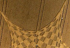
I visited this site on 9.8.06. The ground lay was unremarkable, laid down crop, except for some interesting weaving in the central areas.
The design is not symmetrical. It is based on non-equal arms and moving centres.
The central Star of David is hidden, but appears out of the geometry as explained later. The outer geometry is asymmetrically arranged.
There are 3 green long arms
whose outer points are A2, A4, A6 set on the green circle .
There are 3 red short arms
whose outer points are B1, B3, B5 . set on the inner red circle. From each of these outer starting points the first
3
lines of sets of 6 radiate to the 6 main arms to define the lozenge segments, eg .look at red lines radiating from B1. Line 4 origin then moves inwards one circle level (C1). Line 5 moves further in (D1). Line 6 moves further in (E1). The 6 sided polygon formed by the actual ground lines D1-E2-D3-E4-D5-E6 (red) is at first glance an odd looking shape, but resolves into an equilateral triangle E2-E4-E6 with triangles planted on the sides. The other odd polygon (blue) overlaps, around a Star of David centre. See Kingston Star of David. for more analysis.
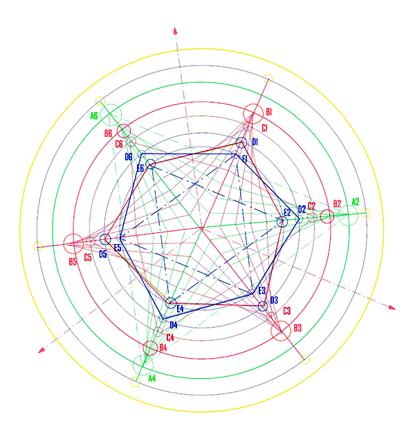
The spacing of the circles appears to be uniform.
The yellow circles at end of each main arm are the end points of the arms (which do not touch the outer circle.) They are the cusps of the 6 parabolae forming the 'petals'. The parabolae are true curves and not formed from straight lines.
The small red triangle in the very centre is formed by the main arms which do not appear to meet in a point, but form a tiny triangle.
The overall design is highly complex and is based on moving centres, and the duality of opposing figures in an asymmetric equilibrium, the whole evolving out from a strong symmetrical central symbol.
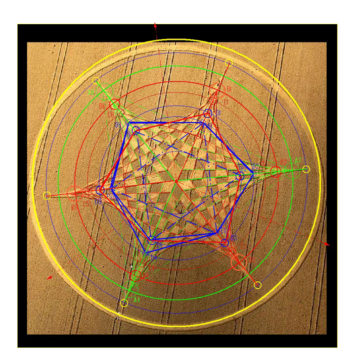
Note: This analysis has been traced over the CCC aerial photo as published, not constructed geometrically. It has not been 'cleaned up'. Due allowance must be made for photo distortion due to angle of view, and curve of the ground, and shadow lines on the ground. However I consider it to accurately represent the geometry of the formation. This image has been saved in Jpeg format but is available in DXF format.
See Overlay below
.
Overlaid on aerial photo: The photo has some distortion especially at top.. However the assumed geometry can be tested by checking for correlation in other parts of the image. A photo-corrected version is given at Kingston Lisle
Analysis of a segment:
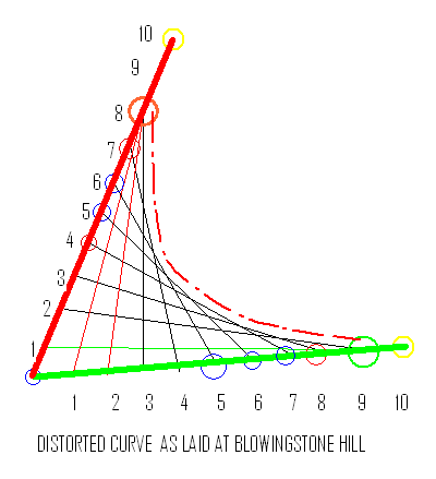
Note the moving point line sequences (the black lines) - on the
green
axis from 3 to 9, on the
red
axis from 2 to 8 ie. asymmetrical, These form the distorted parabolic curve which was then widened out (red dotted line)
On the
green
axis, there is one other line which runs from green 9 to red 1 .
On the
red
axis there are two other lines, which run from red 8 to green 1 and 2.
This is not accidental at it repeats all round the formation.
HOWEVER.........
This segment looks badly finished. The curve is not smooth. Does this clearly indicate a man-made formation?